 |
| "Castle in the Air" -- Oil pastel on cardstock with miscellaneous |
 |
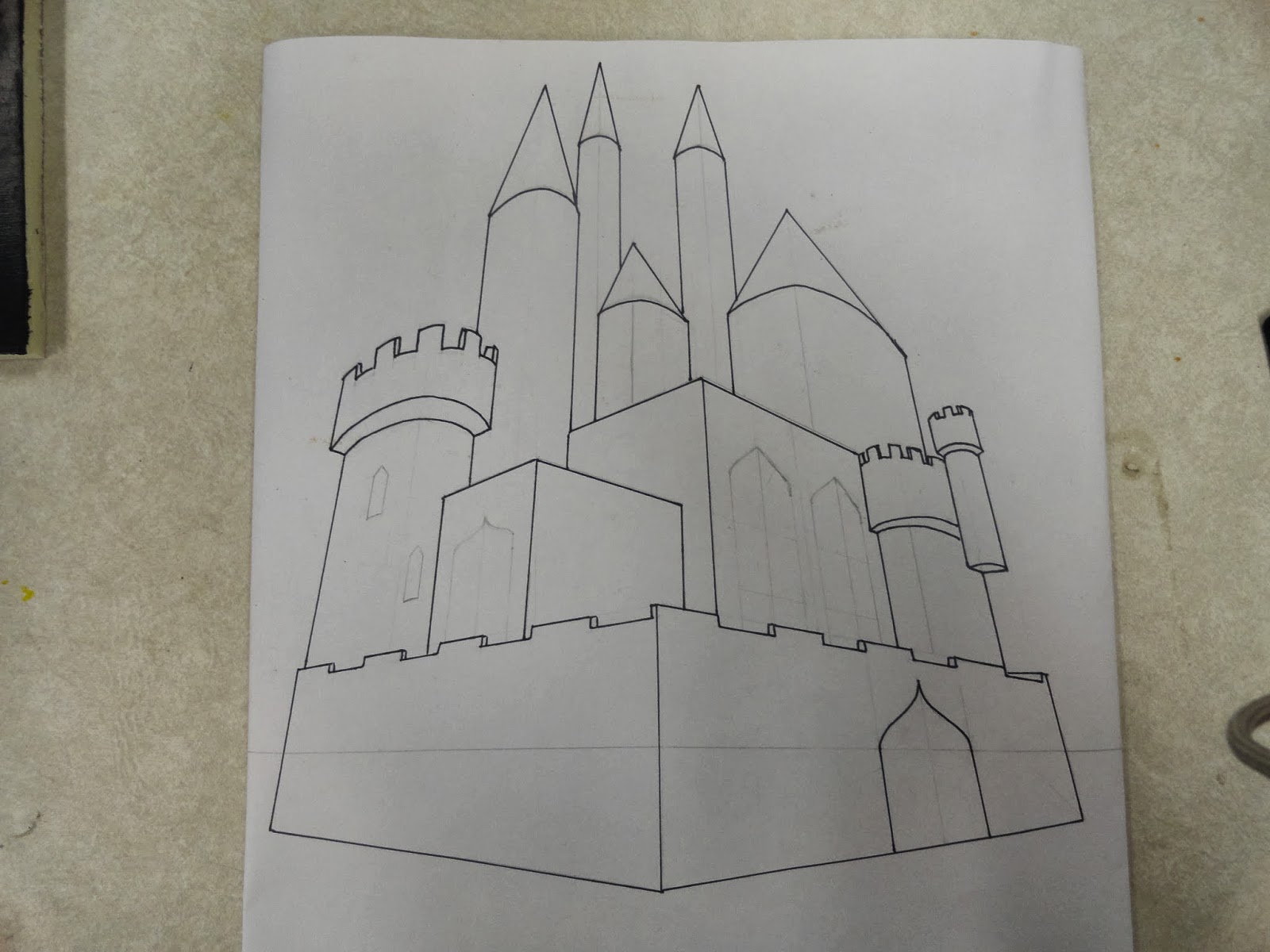
| The original castle |
For this project, Mr. Sands instructed us to implement perspective somehow, plain and simple. We looked at many examples of perspective -- anamorphosis, 1-, 2-, and 3-point, forced, and localized. I knew immediately I wanted to draw a 2- or 3-point perspective castle, but I wanted the piece to be more exciting than a simple drawing. After watching a Honda commercial that used many optical illusions, I decided to use localized perspective in my work. I brainstormed for a while, and remembered one of my favorite quotes:
"If you have built castles in the air, your work need not be lost; that is where they should be. Now put the foundations under them." -- Henry D. Thoreau

Before I could incorporate the localized perspective and quote into my project, I had to start simple. I looked at pictures of real castles, and using them as a reference, I drew my own castle using three-point perspective. (There are two points at the sides of the horizon line and one at the top, so you get the effect of looking at something very tall from the ground.) Then, I outlined it, photographed it, and projected the image.
 |
| Coloring the castle with oil pastels |
In the mean time, I had created a stand for my floating castle. Using copper wire, I twisted seven little stands and hot-glued them to a piece of foam board I had painted black. Then I placed different sized pieces of cardstock into the little stands and adjusted them so the whole castle would be covered and the cards could stand up on their own. I projected the image onto the cards and tried to trace the outline. This was very challenging; as soon as my pencil touched the paper, it would move slightly, throwing off the whole thing. After several tries, I got enough faint lines down to be able to finish. I estimated where the outlines were supposed to be and colored in the castle with oil pastels. Then, I used a Q-tip dipped in baby oil to smooth out the pastels to make the image more presentable. To get more contrast, I shaded some areas with charcoal.

Once I was done coloring, the hard part began. I had labeled the stands and cards before I began drawing on them so I'd be able to put them back. I adjusted the cards so they lined up as much as possible -- it took a lot of crouching and gentle touches to align them perfectly (and they're still not perfect). When the cards were set up, I took some glue and attached the cards to the stands, making sure not to disturb them. Once dry, I cut off some of the excess cardstock and covered the remainder in cotton ball "clouds."

At some point in the middle of this process, I took a break to draw and color the quote banner with colored pencil. I wrote out the quote and outlined it in pen, then cut it out. I placed the banner in a shorter stand glued in the front, finishing the project. Localized perspective means that the image can only be seen from one point. My "point" ended up being below the edge of the castle, so for viewing on Fun Friday, I put the castle on a stool on the table for easier viewing.
Of the projects I've done this year, I'm happiest with the outcome of this one. While some elements were challenging, the overall result was more finished and to my liking than previous projects.

 Before I could incorporate the localized perspective and quote into my project, I had to start simple. I looked at pictures of real castles, and using them as a reference, I drew my own castle using three-point perspective. (There are two points at the sides of the horizon line and one at the top, so you get the effect of looking at something very tall from the ground.) Then, I outlined it, photographed it, and projected the image.
 Once I was done coloring, the hard part began. I had labeled the stands and cards before I began drawing on them so I'd be able to put them back. I adjusted the cards so they lined up as much as possible -- it took a lot of crouching and gentle touches to align them perfectly (and they're still not perfect). When the cards were set up, I took some glue and attached the cards to the stands, making sure not to disturb them. Once dry, I cut off some of the excess cardstock and covered the remainder in cotton ball "clouds."
 At some point in the middle of this process, I took a break to draw and color the quote banner with colored pencil. I wrote out the quote and outlined it in pen, then cut it out. I placed the banner in a shorter stand glued in the front, finishing the project. Localized perspective means that the image can only be seen from one point. My "point" ended up being below the edge of the castle, so for viewing on Fun Friday, I put the castle on a stool on the table for easier viewing.

No comments:
Post a Comment