Currently I am in an Art III class, but I thought it would be cool to post some of my older projects as well. The following projects were the highlights of the Art II class I took last spring as a sophomore.
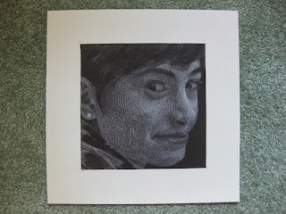 |
| Self portrait -- white pencil on black paper |
The first project we did in Art II required thinking about drawing in a new way. With normal pencil or charcoal you draw shadows, but with white pencil you have to learn to see the highlights. As Mrs. Koefler said poetically, "You have to learn to see the light instead of the dark." To lessen the confusion of thinking backwards, we used a grid, marking up a picture and then filling in corresponding squares on the final project. This is one of my favorite works I've ever done.
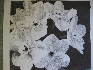 |
| Daffodils -- pen and ink |
Our second project also required us to focus on highlights and shadows, and we still couldn't draw outlines. Using a black and white picture (I took the one of the daffodils myself), we again used a grid method and stippled in the shadows. Stippling is a tedious process, because an entire picture is created from tiny dots that have to be drawn individually. The pen kills your hand after a while. But, from far away, it creates a beautiful effect, especially if the graduation of shadow is done well and there is high contrast.
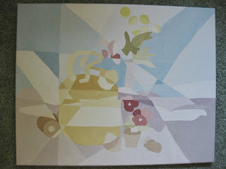 |
| Cubism piece -- acrylic on canvas |
The next project we did looked at cubism and its elements. We had to use and mix eighty low-intensity colors -- ten tints of red, orange, yellow, green, blue, purple, brown, and black. This means that from the base colors of red, blue, and yellow, we made five other base colors, and then added the complementary color of each base to make each hue less vibrant. Then, we added the base to white, slowly increasing the amount of base and painting after each addition to make ten tints. Our paintings also had to incorporate three elements of cubism -- mine includes simplification and fraction lines.
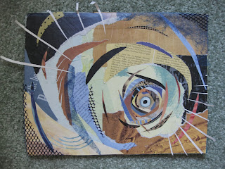 |
| Collage -- paper and miscellaneous on cardboard |
In another unit, Mrs. Koefler taught us about the difference between the terms 'abstract' and 'non-objective.' To the everyday art observer, anything that is not realistic-looking is labeled abstract art. However, the word 'abstract' refers to images and objects that are recognizable but distorted. Artwork that contains lines, colors, shapes, and other hokum but does not portray some
thing is considered non-objective (get it?
no object.) For example, Salvador Dalí's paintings of melting clocks are abstract art; they contain distorted clocks, trees, and other objects. A canvas of splattered paint, on the other hand, would be non-objective. To help us understand the difference, Mrs. Koefler instructed us to make a collage. We were to implement the elements of art -- create movement, have a focus and texture, and use colors, line, and contrast to guide the viewers eye and make the piece stronger. Turning the collage every few minutes to get a new angle also helped ensure that the piece was non-objective and pleasing to the eye from any direction.
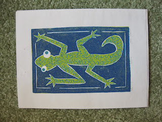 |
| Gecko prints -- ink on paper |
One of our final projects in Art II was print making. We could either use a Plexiglas or linoleum to stamp our prints, and since I was unused to linoleum blocks, I thought it would be fun to experiment. After much deliberation, I decided to make a gecko print. We were allowed to use up to three colors of ink, and the color of the paper added a possible fourth color. Print making is tricky for two main reasons. When carving the linoleum, you have to think backwards from the end result, and it's mind-boggling at first. The space you carve isn't what will be colored -- the negative space, or uncarved linoleum, is where the ink goes. For my gecko, I printed three layers -- teal, then green, then dark blue. I first carved all the outlines, then printed in teal to get a teal rectangle with a white outline. Then, I carved out the lizard's eyes and curly-cues of the gecko's body so that they would remain teal and printed green, so everything but the white outlines, curly-cues, and eyes were green. Lastly, I carved out the rest of the gecko and printed blue to get the blue background. The second challenge in print-making is getting the lines to match up. To heighten the chances of getting the perfect print, you print multiples. I ended up with nine finished geckos.
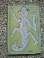 |
| the linoleum block stamp used to make the geckos |
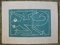 |
| the first layer in making the gecko |
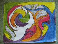 |
| Just a doodle. Acrylic and pen on paper. |